jQuery EasyUI 佈局插件 - Tabs 標籤頁/選項卡
 jQuery EasyUI 插件
通過 $.fn.tabs.defaults 重寫默認的 defaults。
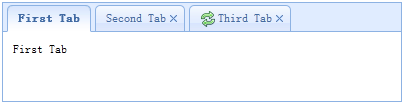
The tabs display a collection of panel. It shows only one tab panel at a time. Each tab panel has the header title and some mini button tools, including close button and other customized buttons.
依賴
- panel
- linkbutton
用法
創建標籤頁(Tabs)
1、通過標記創建標籤頁(Tabs)
從標記創建標籤頁(Tabs)更容易,我們不需要寫任何 JavaScript 代碼。記住把 'easyui-tabs' class 添加到 <div> 標記。每個標籤頁面板(tab panel)通過子 <div> 標記被創建,其用法與面板(panel)一樣。
<div id="tt" class="easyui-tabs" style="width:500px;height:250px;">
    <div title="Tab1" style="padding:20px;display:none;">
        tab1
    </div>
    <div title="Tab2" data-options="closable:true" style="overflow:auto;padding:20px;display:none;">
        tab2
    </div>
    <div title="Tab3" data-options="iconCls:'icon-reload',closable:true" style="padding:20px;display:none;">
        tab3
    </div>
</div>
2、編程創建標籤頁(Tabs)
現在我們編程創建標籤頁(Tabs),我們同時捕捉 'onSelect' 事件。
$('#tt').tabs({
    border:false,
    onSelect:function(title){
        alert(title+' is selected');
    }
});
添加新的標籤頁面板(tab panel)
通過迷你工具添加一個新的標籤頁面板(tab panel),迷你工具圖示(8x8)放置在關閉按鈕前。
// 添加一個新的標籤頁面板(tab panel)

$('#tt').tabs('add',{
    title:'New Tab',
    content:'Tab Body',
    closable:true,
    tools:[{
        iconCls:'icon-mini-refresh',
        handler:function(){
            alert('refresh');
        }
    }]
});
獲取選中的標籤頁(Tab)
// 獲取選中的標籤頁面板(tab panel)和它的標籤頁(tab)對象

var pp = $('#tt').tabs('getSelected');
var tab = pp.panel('options').tab; // 相應的標籤頁(tab)對象
屬性
| 名稱 | 類型 | 描述 | 默認值 |
|---|---|---|---|
| width | number | 標籤頁(Tabs)容器的寬度。 | auto |
| height | number | 標籤頁(Tabs)容器的高度。 | auto |
| plain | boolean | 當設置為 true 時,就不用背景容器圖片來呈現 tab 條。 | false |
| fit | boolean | 當設置為 true 時,就設置標籤頁(Tabs)容器的尺寸以適應它的父容器。 | false |
| border | boolean | 當設置為 true 時,就顯示標籤頁(Tabs)容器邊框。 | true |
| scrollIncrement | number | 每按一次 tab 滾動按鈕,滾動的像素數。 | 100 |
| scrollDuration | number | 每一個滾動動畫應該持續的毫秒數。 | 400 |
| tools | array,selector | 放置在頭部的左側或右側的工具欄,可能的值: 1、數組,指示工具組,每個工具選項都和鏈接按鈕(Linkbutton)一樣。 2、選擇器,指示包含工具的 <div>。 代碼實例: 通過數組定義工具。
$('#tt').tabs({
    tools:[{
        iconCls:'icon-add',
        handler:function(){
            alert('add')
        }
    },{
        iconCls:'icon-save',
        handler:function(){
            alert('save')
        }
    }]
});
通過已有的 DOM 容器定義工具。
$('#tt').tabs({
    tools:'#tab-tools'
});
<div id="tab-tools">
    <a href="#" class="easyui-linkbutton" plain="true" iconCls="icon-add"></a>
    <a href="#" class="easyui-linkbutton" plain="true" iconCls="icon-save"></a>
</div>
|
null |
| toolPosition | string | 工具欄位置。可能的值:'left'、'right'。該屬性自版本 1.3.2 起可用。 | right |
| tabPosition | string | 標籤頁(tab)位置。可能的值:'top'、'bottom'、'left'、'right'。該屬性自版本 1.3.2 起可用。 | top |
| headerWidth | number | 標籤頁(tab)頭部寬度,只有當 tabPosition 設置為 'left' 或 'right' 時才有效。該屬性自版本 1.3.2 起可用。 | 150 |
| tabWidth | number | tab 條的寬度。該屬性自版本 1.3.4 起可用。 | auto |
| tabHeight | number | tab 條的高度。該屬性自版本 1.3.4 起可用。 | 27 |
| selected | number | 初始化選定的標籤頁索引。該屬性自版本 1.3.5 起可用。 | 0 |
| showHeader | boolean | 當設置為 true 時,顯示標籤頁(tab)頭部。該屬性自版本 1.3.5 起可用。 | true |
事件
| 名稱 | 參數 | 描述 |
|---|---|---|
| onLoad | panel | 當一個 ajax 標籤頁面板(tab panel)完成加載遠程數據時觸發。 |
| onSelect | title,index | 當用戶選擇一個標籤頁面板(tab panel)時觸發。 |
| onUnselect | title,index | 當用戶未選擇一個標籤頁面板(tab panel)時觸發。該事件自版本 1.3.5 起可用。 |
| onBeforeClose | title,index | 當一個標籤頁面板(tab panel)被關閉前觸發,返回 false 就取消關閉動作。下麵的實例演示如何在關閉標籤頁面板(tab panel)前顯示確認對話框。
$('#tt').tabs({
  onBeforeClose: function(title){
    return confirm('Are you sure you want to close ' + title);
  }
});
// using the async confirm dialog
$('#tt').tabs({
  onBeforeClose: function(title,index){
    var target = this;
    $.messager.confirm('Confirm','Are you sure you want to close '+title,function(r){
        if (r){
            var opts = $(target).tabs('options');
            var bc = opts.onBeforeClose;
            opts.onBeforeClose = function(){};  // allowed to close now
            $(target).tabs('close',index);
            opts.onBeforeClose = bc;  // restore the event function
        }
    });
    return false;    // prevent from closing
  }
});
|
| onClose | title,index | 當用戶關閉一個標籤頁面板(tab panel)時觸發。 |
| onAdd | title,index | 當一個新的標籤頁面板(tab panel)被添加時觸發。 |
| onUpdate | title,index | 當一個標籤頁面板(tab panel)被更新時觸發。 |
| onContextMenu | e, title,index | 當一個標籤頁面板(tab panel)被右鍵點擊時觸發。 |
方法
| 名稱 | 參數 | 描述 |
|---|---|---|
| options | none | 返回標籤頁(tabs)選項(options)。 |
| tabs | none | 返回全部的標籤頁面板(tab panel)。 |
| resize | none | 調整標籤頁(tabs)容器的尺寸並做佈局。 |
| add | options | 添加一個新的標籤頁面板(tab panel),options 參數是一個配置對象,更多詳細資訊請參見標籤頁面板(tab panel)屬性。 當添加一個新的標籤頁面板(tab panel)時,它將被選中。 如需添加一個未選中的標籤頁面板(tab panel),請記得設置 'selected' 屬性為 false。
// add a unselected tab panel
$('#tt').tabs('add',{
    title: 'new tab',
    selected: false
    //...
});
|
| close | which | 關閉一個標籤頁面板(tab panel),'which' 參數可以是要被關閉的標籤頁面板(tab panel)的標題(title)或索引(index)。 |
| getTab | which | 獲取指定的標籤頁面板(tab panel),'which' 參數可以是標籤頁面板(tab panel)的標題(title)或索引(index)。 |
| getTabIndex | tab | 獲取指定的標籤頁面板(tab panel)索引。 |
| getSelected | none | 獲取選中的標籤頁面板(tab panel)。下麵的實例演示如何獲取選中的標籤頁面板(tab panel)的索引。
var tab = $('#tt').tabs('getSelected');
var index = $('#tt').tabs('getTabIndex',tab);
alert(index);
|
| select | which | 選擇一個標籤頁面板(tab panel),'which' 參數可以是標籤頁面板(tab panel)的標題(title)或索引(index)。 |
| unselect | which | 選擇一個標籤頁面板(tab panel),'which' 參數可以是標籤頁面板(tab panel)的標題(title)或索引(index)。該方法自版本 1.3.5 起可用。 |
| showHeader | none | 顯示標籤頁(tabs)頭部。該方法自版本 1.3.5 起可用。 |
| hideHeader | none | 隱藏標籤頁(tabs)頭部。該方法自版本 1.3.5 起可用。 |
| exists | which | 指示指定的面板是否已存在,'which' 參數可以是標籤頁面板(tab panel)的標題(title)或索引(index)。 |
| update | param | 更新指定的標籤頁面板(tab panel),param 參數包含兩個屬性: tab:被更新的標籤頁面板(tab panel)。 options:面板(panel)的選項(options)。 代碼實例:
// update the selected panel with new title and content
var tab = $('#tt').tabs('getSelected');  // get selected panel
$('#tt').tabs('update', {
    tab: tab,
    options: {
        title: 'New Title',
        href: 'get_content.php'  // the new content URL
    }
});

// call 'refresh' method for tab panel to update its content
var tab = $('#tt').tabs('getSelected');  // get selected panel
tab.panel('refresh', 'get_content.php');
|
| enableTab | which | 啟用指定的標籤頁面板(tab panel),'which' 參數可以是標籤頁面板(tab panel)的標題(title)或索引(index)。該方法自版本 1.3 起可用。 代碼實例:
$('#tt').tabs('enableTab', 1);    // enable the second tab panel
$('#tt').tabs('enableTab', 'Tab2');    enable the tab panel that has 'Tab2' title
|
| disableTab | which | 禁用指定的標籤頁面板(tab panel),'which' 參數可以是標籤頁面板(tab panel)的標題(title)或索引(index)。該方法自版本 1.3 起可用。 代碼實例:
$('#tt').tabs('disableTab', 1); // disable the second tab panel.
|
| scrollBy | deltaX | 通過指定的像素數滾動標籤頁(tab)頭部,負值表示滾動到右邊,正值表示滾動到左邊。該方法自版本 1.3.2 起可用。 代碼實例:
// scroll the tab header to left
$('#tt').tabs('scroll', 10);
|
標籤頁面板(Tab Panel)
標籤頁面板(tab panel)屬性被定義在面板(panel)組件裏,下麵是一些常用的屬性。
| 名稱 | 類型 | 描述 | 默認值 |
|---|---|---|---|
| id | string | 標籤頁面板(tab panel)的 id 屬性。 | null |
| title | string | 標籤頁面板(tab panel)的標題文字。 | |
| content | string | 標籤頁面板(tab panel)的內容。 | |
| href | string | 加載遠程內容來填充標籤頁面板(tab panel)的 URL。 | null |
| cache | boolean | 當設置為 true 時,在設定了有效的 href 特性時緩存這個標籤頁面板(tab panel)。 | true |
| iconCls | string | 顯示在標籤頁面板(tab panel)標題上的圖示的 CSS class。 | null |
| width | number | 標籤頁面板(tab panel)的寬度。 | auto |
| height | number | 標籤頁面板(tab panel)的高度。 | auto |
| collapsible | boolean | 當設置為 true 時,允許標籤頁面板(tab panel)可折疊。 | false |
一些附加的屬性。
| 名稱 | 類型 | 描述 | 默認值 |
|---|---|---|---|
| closable | boolean | 當設置為 true 時,標籤頁面板(tab panel)將顯示一個關閉按鈕,點擊它就能關閉這個標籤頁面板(tab panel)。 | false |
| selected | boolean | 當設置為 true 時,標籤頁面板(tab panel)將被選中。 | false |
jQuery EasyUI 插件