Python具有用於數據可視化的一些很不錯的類庫。 Pandas,numpy和matplotlib的組合可以幫助創建幾乎所有類型的可視化圖表。 在本章中,我們將開始查看一些簡單的圖表和圖表的各種屬性。
創建圖表
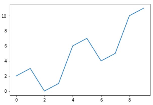
這裏使用numpy庫創建要創建圖表所需的數字,並使用matplotlib中的pyplot方法繪製實際圖表。
import numpy as np
import matplotlib.pyplot as plt

x = np.arange(0,10)
y = x ^ 2
#Simple Plot
plt.plot(x,y)
print('yes, all jobs done')
執行上面示例代碼,得到輸出的圖形如下 -
標記軸
可以使用庫中的適當方法將標籤應用於軸以及圖表的標題,如下所示。
import numpy as np
import matplotlib.pyplot as plt

x = np.arange(0,10)
y = x ^ 2
#Labeling the Axes and Title
plt.title("Graph Drawing")
plt.xlabel("Time")
plt.ylabel("Distance")
#Simple Plot
plt.plot(x,y)
執行上面示例代碼,得到輸出的圖形如下 -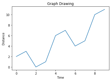
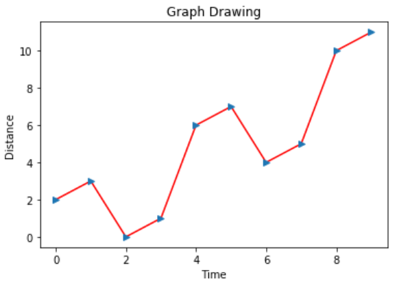
格式化線條類型和顏色
圖表中線條的樣式和顏色可以使用庫中適當的方法指定,如下所示。
import numpy as np
import matplotlib.pyplot as plt

x = np.arange(0,10)
y = x ^ 2
#Labeling the Axes and Title
plt.title("Graph Drawing")
plt.xlabel("Time")
plt.ylabel("Distance")

# Formatting the line colors
plt.plot(x,y,'r')

# Formatting the line type
plt.plot(x,y,'>')
執行上面示例代碼,得到輸出的圖形如下 -
保存圖表檔
如下所示,可以使用庫中的適當方法將圖表保存為不同的圖像檔格式。
import numpy as np
import matplotlib.pyplot as plt

x = np.arange(0,10)
y = x ^ 2
#Labeling the Axes and Title
plt.title("Graph Drawing")
plt.xlabel("Time")
plt.ylabel("Distance")

# Formatting the line colors
plt.plot(x,y,'r')

# Formatting the line type
plt.plot(x,y,'>')

# save in pdf formats
plt.savefig('timevsdist.pdf', format='pdf')
上面的代碼在python環境的默認路徑中創建pdf檔。
上一篇:
Python詞幹與詞形化
下一篇:
Python圖表樣式